
Note
Click here to download the full example code or to run this example in your browser via Binder
Investigating and interpreting dirty categories
What are dirty categorical variables and how can a good encoding help with statistical learning?
We illustrate how categorical encodings obtained with
the GapEncoder can be interpreted in terms of latent topics.
We use as example the employee salaries dataset.
What do we mean by dirty categories?
Let’s look at the dataset:
from dirty_cat import datasets

employee_salaries = datasets.fetch_employee_salaries()
print(employee_salaries.description)
data = employee_salaries.X
print(data.head(n=5))
Out:
Annual salary information including gross pay and overtime pay for all active, permanent employees of Montgomery County, MD paid in calendar year 2016. This information will be published annually each year.
  gender department  ... date_first_hired year_first_hired
0      F        POL  ...       09/22/1986             1986
1      M        POL  ...       09/12/1988             1988
2      F        HHS  ...       11/19/1989             1989
3      M        COR  ...       05/05/2014             2014
4      M        HCA  ...       03/05/2007             2007

[5 rows x 9 columns]
Here is the number of unique entries per column:
print(data.nunique())
Out:
gender                        2
department                   37
department_name              37
division                    694
assignment_category           2
employee_position_title     385
underfilled_job_title        84
date_first_hired           2264
year_first_hired             51
dtype: int64
As we can see, some entries have many unique values:
print(data["employee_position_title"].value_counts().sort_index())
Out:
Abandoned Vehicle Code Enforcement Specialist        4
Accountant/Auditor I                                 3
Accountant/Auditor II                                1
Accountant/Auditor III                              35
Administrative Assistant to the County Executive     1
                                                    ..
Welder                                               3
Work Force Leader I                                  1
Work Force Leader II                                28
Work Force Leader III                                2
Work Force Leader IV                                 9
Name: employee_position_title, Length: 385, dtype: int64
These different entries are often variations of the same entity. For example, there are 3 kinds of “Accountant/Auditor”.
Such variations will break traditional categorical encoding methods:
Using a simple
OneHotEncoderwill create orthogonal features, whereas it is clear that those 3 terms have a lot in common.If we wanted to use word embedding methods such as Word2vec, we would have to go through a cleaning phase: those algorithms are not trained to work on data such as “Accountant/Auditor I”. However, this can be error-prone and time-consuming.
The problem becomes easier if we can capture relationships between entries.
To simplify understanding, we will focus on the column describing the employee’s position title:
values = data[["employee_position_title", "gender"]]
values.insert(0, "current_annual_salary", employee_salaries.y)
String similarity between entries
That’s where our encoders get into play.
In order to robustly embed dirty semantic data, the SimilarityEncoder
creates a similarity matrix based on an n-gram representation of the data.
sorted_values = values["employee_position_title"].sort_values().unique()

from dirty_cat import SimilarityEncoder

similarity_encoder = SimilarityEncoder()
transformed_values = similarity_encoder.fit_transform(sorted_values.reshape(-1, 1))
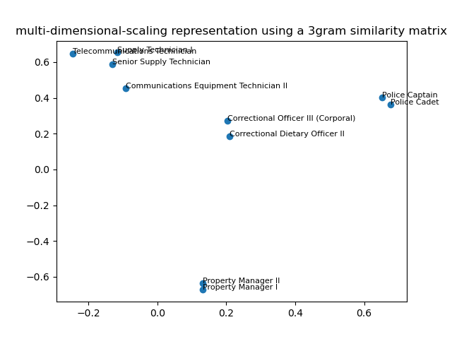
Plotting the new representation using multi-dimensional scaling
Let’s now plot a couple of points at random using a low-dimensional
representation to get an intuition of what the SimilarityEncoder is doing:
from sklearn.manifold import MDS

mds = MDS(dissimilarity="precomputed", n_init=10, random_state=42)
two_dim_data = mds.fit_transform(1 - transformed_values)
# transformed values lie in the 0-1 range,
# so 1-transformed_value yields a positive dissimilarity matrix
print(two_dim_data.shape)
print(sorted_values.shape)
Out:
/usr/lib/python3/dist-packages/sklearn/manifold/_mds.py:299: FutureWarning: The default value of `normalized_stress` will change to `'auto'` in version 1.4. To suppress this warning, manually set the value of `normalized_stress`.
  warnings.warn(
(385, 2)
(385,)
We first quickly fit a KNN so that the plots does not get too busy:
import numpy as np
from sklearn.neighbors import NearestNeighbors

n_points = 5
np.random.seed(42)

random_points = np.random.choice(
    len(similarity_encoder.categories_[0]), n_points, replace=False
)
nn = NearestNeighbors(n_neighbors=2).fit(transformed_values)
_, indices_ = nn.kneighbors(transformed_values[random_points])
indices = np.unique(indices_.squeeze())
Then we plot it, adding the categories in the scatter plot:
import matplotlib.pyplot as plt

f, ax = plt.subplots()
ax.scatter(x=two_dim_data[indices, 0], y=two_dim_data[indices, 1])
# adding the legend
for x in indices:
    ax.text(
        x=two_dim_data[x, 0],
        y=two_dim_data[x, 1],
        s=sorted_values[x],
        fontsize=8,
    )
ax.set_title("multi-dimensional-scaling representation using a 3gram similarity matrix")
Out:
Text(0.5, 1.0, 'multi-dimensional-scaling representation using a 3gram similarity matrix')
Heatmap of the similarity matrix
We can also plot the distance matrix for those observations:
f2, ax2 = plt.subplots(figsize=(6, 6))
cax2 = ax2.matshow(transformed_values[indices, :][:, indices])
ax2.set_yticks(np.arange(len(indices)))
ax2.set_xticks(np.arange(len(indices)))
ax2.set_yticklabels(sorted_values[indices], rotation=30)
ax2.set_xticklabels(sorted_values[indices], rotation=60, ha="right")
ax2.xaxis.tick_bottom()
ax2.set_title("Similarities across categories")
f2.colorbar(cax2)
f2.tight_layout()
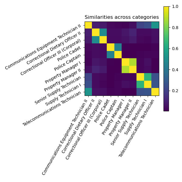
As shown in the previous plot, we see that the nearest neighbor of “Communication Equipment Technician” is “Telecommunication Technician”, although it is also very close to senior “Supply Technician”: therefore, we grasp the “Communication” part (not initially present in the category as a unique word) as well as the “Technician” part of this category.
Feature interpretation with the GapEncoder
The GapEncoder is a better encoder than the
SimilarityEncoder in the sense that it is more scalable and
interpretable, which we will present now.
First, let’s retrieve the dirty column to encode:
dirty_column = "employee_position_title"
X_dirty = data[[dirty_column]]
print(X_dirty.head(), end="\n\n")
print(f"Number of dirty entries = {len(X_dirty)}")
Out:
       employee_position_title
0  Office Services Coordinator
1        Master Police Officer
2             Social Worker IV
3       Resident Supervisor II
4      Planning Specialist III

Number of dirty entries = 9228
Encoding dirty job titles
Then, we’ll create an instance of the GapEncoder with 10 components:
from dirty_cat import GapEncoder

enc = GapEncoder(n_components=10, random_state=42)
Finally, we’ll fit the model on the dirty categorical data and transform it in order to obtain encoded vectors of size 10:
X_enc = enc.fit_transform(X_dirty)
print(f"Shape of encoded vectors = {X_enc.shape}")
Out:
Shape of encoded vectors = (9228, 10)
Interpreting encoded vectors
The GapEncoder can be understood as a continuous encoding
on a set of latent topics estimated from the data. The latent topics
are built by capturing combinations of substrings that frequently
co-occur, and encoded vectors correspond to their activations.
To interpret these latent topics, we select for each of them a few labels
from the input data with the highest activations.
In the example below we select 3 labels to summarize each topic.
topic_labels = enc.get_feature_names_out(n_labels=3)
for k in range(len(topic_labels)):
    labels = topic_labels[k]
    print(f"Topic n°{k}: {labels}")
Out:
Topic n°0: correctional, correction, warehouse
Topic n°1: administrative, specialist, principal
Topic n°2: services, officer, service
Topic n°3: coordinator, equipment, operator
Topic n°4: firefighter, rescuer, rescue
Topic n°5: management, enforcement, permitting
Topic n°6: technology, technician, mechanic
Topic n°7: community, sergeant, sheriff
Topic n°8: representative, accountant, auditor
Topic n°9: assistant, library, safety
As expected, topics capture labels that frequently co-occur. For instance, the labels “firefighter”, “rescuer”, “rescue” appear together in “Firefighter/Rescuer III”, or “Fire/Rescue Lieutenant”.
This enables us to understand the encoding of different samples
encoded_labels = enc.transform(X_dirty[:20])
plt.figure(figsize=(8, 10))
plt.imshow(encoded_labels)
plt.xlabel("Latent topics", size=12)
plt.xticks(range(0, 10), labels=topic_labels, rotation=50, ha="right")
plt.ylabel("Data entries", size=12)
plt.yticks(range(0, 20), labels=X_dirty[:20].to_numpy().flatten())
plt.colorbar().set_label(label="Topic activations", size=12)
plt.tight_layout()
plt.show()
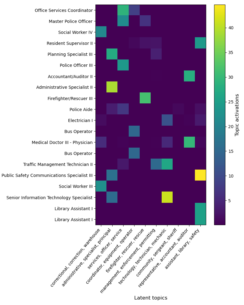
As we can see, each dirty category encodes on a small number of topics, These can thus be reliably used to summarize each topic, which are in effect latent categories captured from the data.
Total running time of the script: ( 0 minutes 15.861 seconds)